WPfomify Documentation
Understanding the Customize Tab
The Customize Tab allows you to make changes to the appearance, timing, behavior, design of the notifications, floating button and the notification bar.
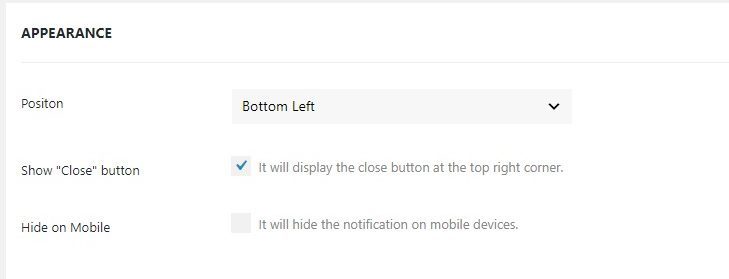
Appearance
Here you can make changes to how your notification bar or conversions appear to the user.
- Position: You can choose to display the notifications on the bottom left or the bottom right corner of the page. In case of the notification bar, you get an option to display it at the top or the bottom of the page.
- Show Close button: This option allows you to give your user an option to close by clicking on the close icon on the top right corner of the notification.
- Hide on Mobile: Checking this option will disable the notifications on mobile devices.
- Sticky Bar? (notification bar) : Checking this option makes the bar stick to the top.
- Always show content popup (floating button): Checking this option will display the content popup box every time.
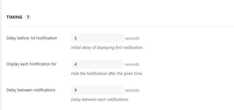
Timing
The timing tab allows you to customize how often you want your notifications to appear.
We have optimized the timing for highest conversions with the Auto setting. However, in some instances, you may want to set your own custom values and you can easily do that from these options. To begin, Toggle the button to “custom” to begin customization.
- Delay before 1st Notification: This defines the time duration for the first notification to appear.
- Display each Notification for: This defines the time duration for which the notifications should appear.
- Display between Notifications: This option defines the “gap” or the duration between the notifications.
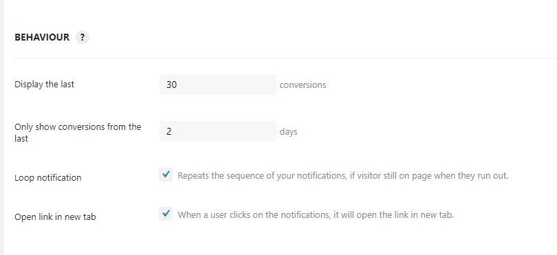
Behavior
With the Behaviour tab, you can change the display properties of the notifications.
The settings of the behavior sub-section are optimized for maximum conversions. However, you can edit the settings by switching to Custom mode.
- Display the last: These settings define the number of conversions to display on the website.
- Only show conversions from the last: The value defines the past days for which you want to display your notifications.
- Loop notification: If this check box is selected, it will loop the notifications and will start displaying the notifications again if the user runs out.
- Open link in new tab: If you select this option, the link to the notifications will open up in a new tab.
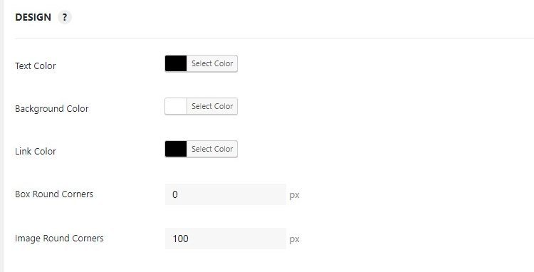
Design
The Design sub-section is where you can change the style, design, layout, color, shadow, and the border of your notification box. We have designed the notification for best appearance but if you would like to make any changes to the design, you can easily do it with by switching to Custom mode.
Design Settings
- Text Color: as the name says, you can choose the color of the Text in the notification via this option.
- Background Color: You can choose the color of the Background of the notification via this option.
- Link Color: You can use the color palette to choose your desired color for the link in the box.
- Box Round Corners: Give softer edges to your notifications using this option.
- Image Round Corners: You can also give rounded corners to the image as well.
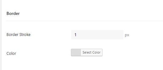
Border Settings
- Border Stroke: You can choose the width of the border using this option.
- Color: You can choose the border color using this option.
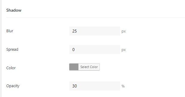
Shadow Settings
- Blur: This defines the density of the color from the border.
- Spread: This field decides the size of the blur radius.
- Color: This option lets you choose the color of the blur.
- Opacity: This value defines the opacity/ transparency of the shadow option.
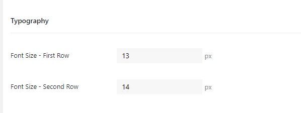
Typography Settings
- Font Size – First Row: Enter the value to set the font size of the first row.
- Font Size – Second Row: Enter the value to set the font size of the second row.
